During the first week with my brand new car, I noticed that — for some mysterious reason — the time on the infotainment system did not match the time on my Apple Watch. Before driving to work, I quickly wanted to adjust the time so that it was correct again. I couldn’t find the time settings on the infotainment system. To my surprise, I couldn’t even find the general settings of the car. Finding the general settings seemed impossible, I knew it was there, but where? It had been a long time since I felt this stupid using an interface.
At one point I gave up. There was only one thing left to do. Call or email the car seller. Therefore, the following day, I decided to email the car seller to ask him how I could change the time settings of my car. The answer was quite simple: “You should have an icon with 4 squares on the bottom left, this will give you an overview of all settings and general settings.” I was stunned. How could I have missed this? And had I really bothered someone with my problem before I had RTFM? I’ll explain why this happened below.
Reason 1: Mental model
My mental model is what I believe how the system will work. When I touched the ‘home’ button on the infotainment interface, I assumed it would take me to an overview screen of general settings. Instead, the system took me to a a fancy screen with 3 panels in diagonal shapes.
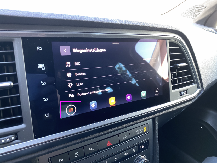
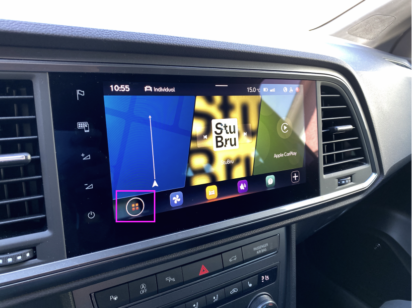
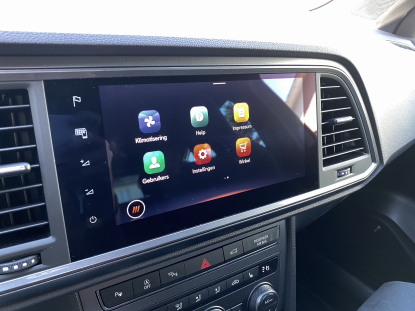
For the first few tries going back and forth, I didn’t notice that the ‘home’ button changed to a different icon. After a few tries I realised the icon changed. An Icon I didn’t gave much thought because for me this icon stands for a grid view, which is the standard for Google’s Material Design Icons Library. Therefore, I believed this was just another fancy view state of the 3 panels.
Little did I know that the Grid View-icon would take me to an overview of all the car settings. After I had a call with the car seller I immediately knew where I have been wrong. The answer was so simple, nevertheless I failed in completing my task. That is why it is so important to take into account the mental model of your users when designing a product.
Reason 2: Recognition rather than recall
There might have been confusion with the icons for the designer which designed this interface, since the Grid View icon and the Apps icon are looking very similar. Or more likely, I am an edge case because of my professional bias as a UX Designer which makes me understand icons and their meaning better than other people. However, the risk of this happening could be somewhat avoided by adding text labels to the icons.
One of the 10 usability heuristics by Dr. Jakob Nielsen is about recognition rather than recall. Basically, taking into account this heuristic means you optimise your interface to minimise the user’s memory load. Therefore, your user will have to make less cognitive effort while using your interface. Humans have limited cognitive power, so minimising the cognitive effort will not only make your interface pleasant to use, it will also be beneficial when you’re driving a 2000 kg vehicle on a busy road. That is why adding text labels to your icons will help your users while they are trying to complete a task.
Conclusion
The design of such interfaces requires not only thorough user research, but also thorough consideration about the implementation of best practices, design patterns and its trade-offs. When your users are interacting with an interface that is attached to heavy machines, it’s more important than ever to make sure you make the experience as frictionless as possible.
This blog post is not written to judge or prejudge. I’m just trying to explain the importance of taking into account mental models and usability heuristics using an example that frustrated me in my personal life. A perfect interface doesn’t exist. We, as UX professionals, can only try to minimise the risks as good as possible. I have the deepest respect for designer who craft these interfaces for users that need to interact with software while they are driving with high speed on a highway or when they are multi multitasking driving through busy streets in cities. Designing products when lives are at stake is one of the most difficult things a UX professional can do.