
Optimising the booking process for a fictitious
airline app (Sep 2020 – Mar 2021)
The problem
During my UX Design Institute Professional UX Diploma course we needed to solve a problem for a fictive client. The client is a start-up airline called Fly UX. They’re looking to create an online experience that is fast, easy, and intuitive: one that’s based on a deep understanding of their target users.
Role and responsibilities
During the course, my role as UX Designer allowed me to have individual responsibilities during the hands-on projects, which were: competitive reviews, online survey, observing a user test, conducting an interview and user test, affinity diagramming, customer journey mapping, user flows, sketching screens and screen states, prototyping, and wireframing.
Research
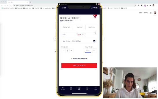
I performed competitive reviews for five competitive airline apps. In addition, I conducted an online survey and I observed two usability tests. We ended the research phase by conducting an interview and two user tests with one participant.
Analysis
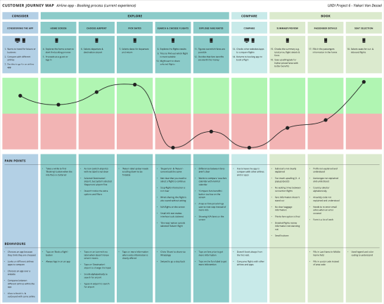
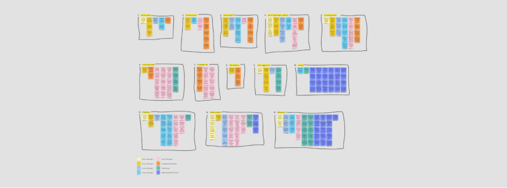
Once the research was done, I analysed the collected raw data using affinity diagramming. The affinity diagram allowed me to group the data into phases to get a better idea of where these problems occurred, and to prepare my alignment diagram such as a Customer Journey Map.
Design
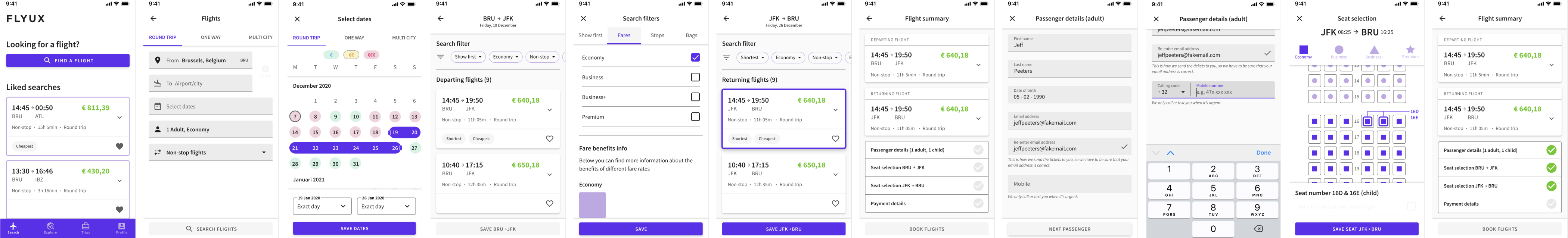
I started by designing an ideal user flow to get the necessary interactions in place. Then I drew all the screens and screenstates for the booking process on paper. I went through the paper sketches by mimicking the user flows’ interactions with my fingers and taking pictures of them as I went along.

Prototype
I designed a medium fidelity prototype. This form of fidelity was exactly right for what we wanted to learn if we wanted to test our solution iteratively by users.

Challenges I faced
I was lucky that at that time I was already working as a UX Designer on an exciting project for the federal government at iO. Therefore, due to time constraints, I was not able to carry out a usability test of my solution for this project. I can only assume that my solution solved at least some of the problems I found during the research.
What I learned and what I’d improve
If this was a request from a client in the real world, I would start with a discovery phase, because there are too many unknowns. Before I would do any of the above work, I would try to figure out these unknowns with the client. If the client is not able to fill in all the gaps, I would set up discovery goals and a good problem statement together with them, so that we have a concrete focus and scope for research we can rely on to find out whether or not improving the booking process would be the best solution.