Strategic UX Redesign for Belgian Foreign Affairs: Communication Goals Meet User Needs
The problem
In 2020 the Belgian Foreign Affairs adopted a communication strategy centered on a “digital first” government approach. Their existing website was outdated, not mobile-friendly, and hindered users from finding essential information. My goal was to redesign the website, ensuring strategic alignment with the new communication goals and providing a superior user experience.
Role & Responsibilities
As UX Strategist at iO, I led the project’s UX direction. This included desk research, user research, analysis, information architecture, concept design, prototyping, testing, functional analysis, and stakeholder collaboration to continually advocate for user-centeredness.
Strategic Context
A previous external agency spearheaded the communication strategy, backed by data from stakeholder interviews, focus groups, and top task analysis. Their insights into goals, channels, and key messages served as a foundation for ensuring my UX designs closely supported strategic objectives.
Research & Analysis
To validate the initial problem hypothesis and identify user needs, I employed:
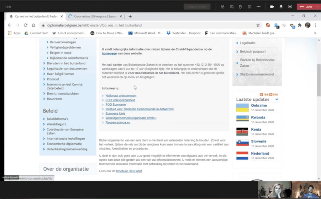
- In-depth interviews & Usability Testing: Revealed user goals, pain points, and task-related behaviors.
- Tree Testing: Quantified how effectively users could navigate existing information architecture.
- Competitive Reviews: Studied successful UX patterns applicable to our government-focused audience.
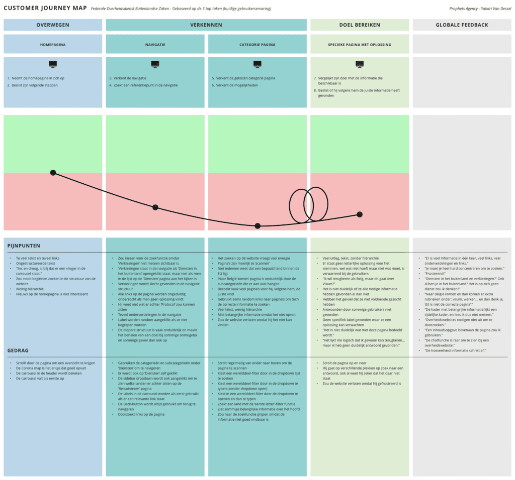
Raw data was analyzed using affinity mapping, leading to a customer journey map and tree test results presentation, which facilitated productive stakeholder discussions.
Information Architecture & Design
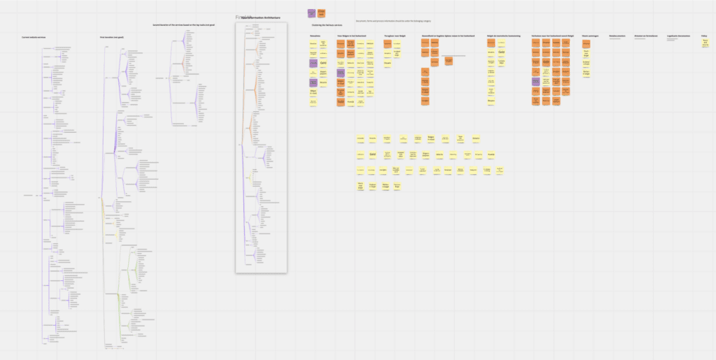
- Content Inventory: I cataloged the vast website content to understand its scope and inform structural decisions.
- Conceptual Information Architecture: Collaborated with stakeholders to draft an IA aligned with both communication goals and user needs.
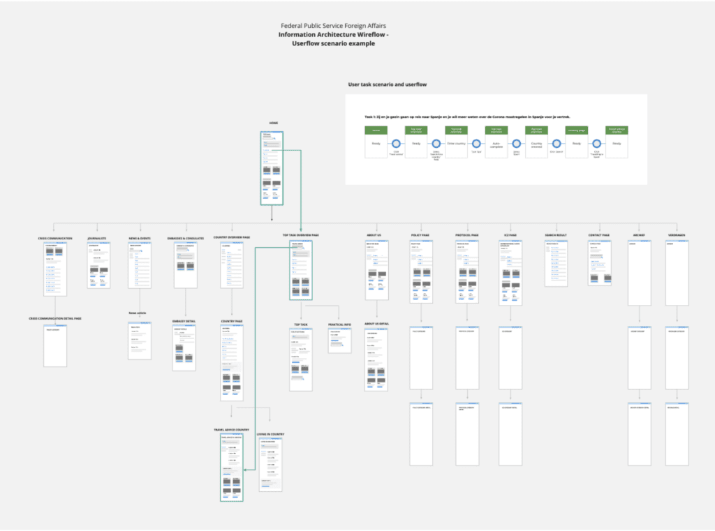
- Ideal User Flows: Designed frictionless flows focused on the top ten user tasks, covering the majority of site traffic.
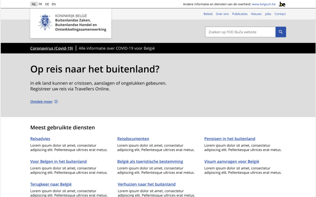
- Sketches & Wireframes: Explored layouts and hierarchy, ensuring content duplication across channels was eliminated.
- Medium-Fidelity Prototype: Created for iterative user testing.
Testing & Outcomes
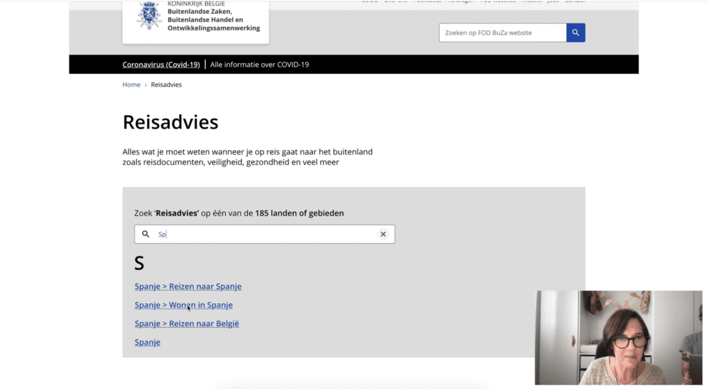
Evaluative usability testing confirmed our design solutions significantly improved the user experience:
- Before: Participants could only complete 3 top tasks within 60 minutes, showing high frustration levels.
- After: Participants completed 11 top tasks in the same timeframe, expressing satisfaction.
The redesign successfully implemented the communication strategy and optimized content structure for easier maintenance.
Learnings & Next Steps
This project honed my UX strategy skills. To further enhance the website’s alignment with long-term digital objectives, I propose:
- UX Strategy Document: A comprehensive strategy to guide ongoing improvements and align with the overarching digital roadmap.
- Service Prioritization: A roadmap outlining which Foreign Affairs services to prioritize for optimal user experience, supporting the “digital first” mandate.
