Belgian Foreign Affairs had a new communication strategy that was part of a digital first government strategy that needed to be implemented. The implementation of a new communication strategy gave the opportunity to completely redesign their website. The Foreign Affairs team hypothesised that their website was outdated and not mobile-friendly. In addition, we had a strong feeling that important content was hard to find. Finding the right and comprehensive content is the main goal of this website. Therefore, we needed to be able to research this. Since a lot of research had been done before, it was up to us to address and demonstrate this.
Role and responsibilities
UX Strategist at iO. I was responsible for the desk research, user research, analysis, information architecture, concept design, prototyping, testing,functional analysis, and discussions with stakeholders to advocate for user-centered design decisions. My team at iO consisted of a UX Architect, UX Designer (me), Project Manager, Functional Analyst, UI Designer, and a dedicated stakeholder team.
Communication strategy context
The communication strategy was done by another agency. They carried out research, such as stakeholder interviews, focus groups and a thorough analysis of the top tasks. With artefacts such as a channel strategy, communication strategy, goals, channels and key messages, all backed up by real user data, they gave us confidence and a clear picture of how and what was important in the federal partners’ communication and service on the Foreign Affairs website. Which gave us a great starting point.
Research
To fill in some gaps about the user’s experience on the website, we conducted explanatory research. I did in-depth interviews and qualitative usability tests based on the top task analysis to get a clear picture of users’ goals, context, pain-points and behaviour. Furthermore, I tested the current information architecture with tree testing to collect data on how well the target audience finds the content on the website. In addition, we conducted competitive reviews of other Foreign Affair and governmental websites that are in line with the Belgian governmental needs to gather best practices and ideas.
A participant trying to complete one of the tasks during a usability test.
Analysis
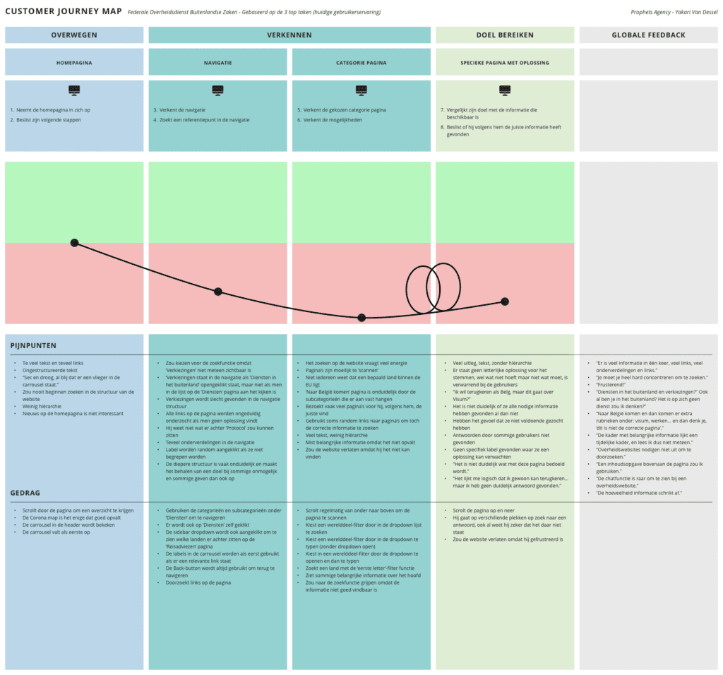
Once the explanatory research was done, I analysed the raw data from the usability test and tree test by using Miro as a tool to affinity diagram (affinity mapping). The affinity diagram allowed me to group the data into themes to get a clear picture of the users’ pain points and behaviour during their journey. We chose to draw up an alignment diagram, such as a customer journey map of the research data, and a slide deck of the tree test to discuss this with the stakeholders.
A Customer Journey Map as an alignment diagram to map out the painful journey of a user in each phase when trying to navigate on the as-is Foreign Affairs website.
Design
Information architecture
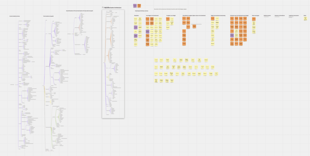
After we defined the problem from the communication strategy, interviews, usability testing and a tree test, we had to develop a deeper understanding of the content itself. Therefore, I made a thorough content inventory in a spreadsheet of most content until I had a clear understanding of the size, content types and page layouts to communicate to our team. The content inventory along with the first draft of an information architecture was presented to stakeholders to discuss our very first conceptual ideas.
Screenshot of a Miro board. Here you can see an iterative process to align the existing content with the communication strategy and the approach to the top tasks.
Sketching screens and wireflows
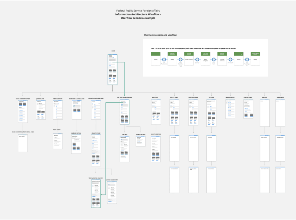
After the general information architecture draft was approved we went to design our first flows and screens. To start with I designed for the first release ideal user flows for the ten top tasks to make the interaction flow as frictionless as possible. ±87% of our users come to the website for these ten top tasks. Furthermore, I sketched some quick basic screens to get a rough idea of the page layouts. Finally, we designed basic wire flows that shows the hierarchy, different page lay-outs, the user flows and how to get rid of duplicate content across different communication channels.
Screenshot of a Miro board. This shows one of the first drafts of wire flows and ideal user flows to determine architecture and the different page layouts to minimise cognitive effort.
Prototype
I designed a medium fidelity prototype. This form of fidelity was exactly right for what we wanted to learn if we wanted to test our solution iteratively by users.
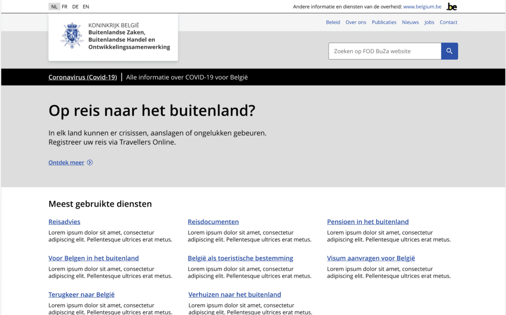
A screenshot of the prototype concept’s home page.
Testing
After the prototype was ready, we conducted another serie of qualitative usability tests to evaluate our new concept. The participants had to perform the same top tasks as in the usability tests during the exploration phase on the as-is Foreign Affairs website. Afterwards, we did some minor design changes based on the findings collected during the usability tests.
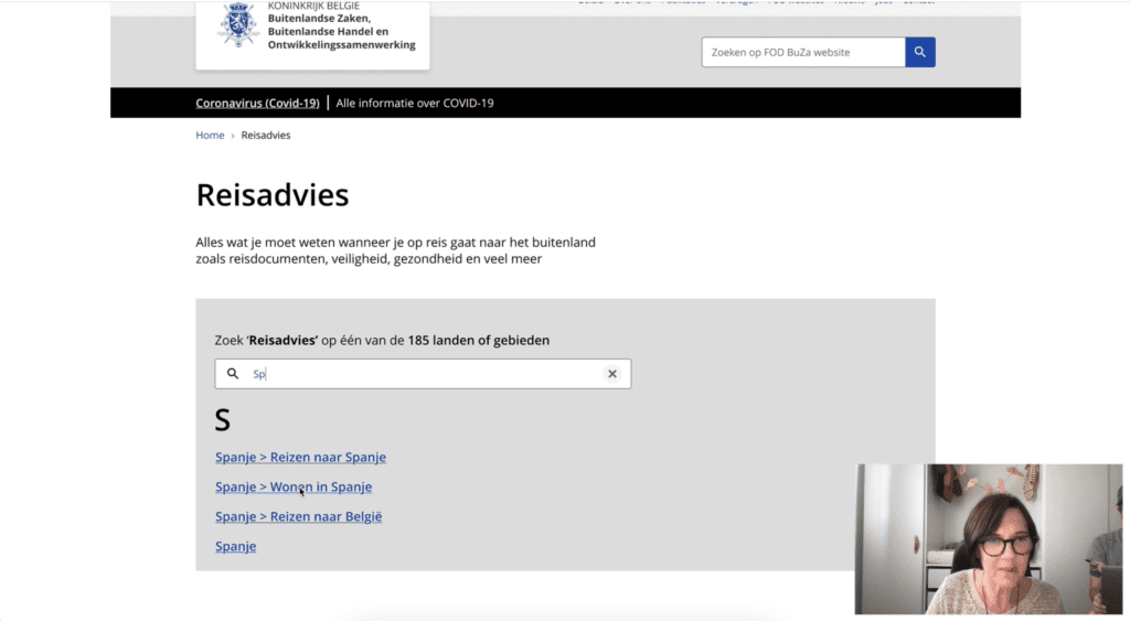
A participants trying to complete a task on the new concept during one of the iterations.
How the solution solved the problem
For the Foreign Affairs department, we made it possible to implement the communication strategy and created the possibility for some important channels to live on the main platform. Duplicated content was also greatly reduced, which significantly reduced the maintenance and time investment of keeping the Foreign Affairs website up-to-date.
On the old Foreign Affairs website, we could clearly see on the Customer Journey Map (as shown above) that the experience was very frustrating. After we ran the evaluative usability tests, we could see that users were happy with our new concept. In comparison, on the old website we could only test 3 top tasks in 60 minutes and all participants were frustrated. With the new concept, we were able to test 11 top tasks in less than 60 minutes and all participants were delighted.
What I learned and what I’d improve
What I learned
This was my first major UX project. Thanks to the UX Architect who had more of a supporting role during the project, I was able to figure everything out myself and ask for feedback or input from him when needed. Thanks to this project, and the trust of the UX Architect, I was able to perform many methods and had to dig deep into reading material and theory to successfully complete this project.
What I would improve
As for what I would improve, I would create a UX strategy to continuously improve and map the vision and goals of the digital strategy. In addition, because of the digital first strategy, I would create a roadmap in which we map out the services of the Foreign Affairs. This would not only give us an overview of which services need to be addressed and which services are already working well digitally, but also allow us to prioritize which services we need to tackle in the short and long term. Furthermore, I would have liked to be more involved in the implementation phase. I’ve been part of the functional and technical analysis to maintain the user’s voice, but not in the phases after these.